Healthcare Check-In App
Project Objective:
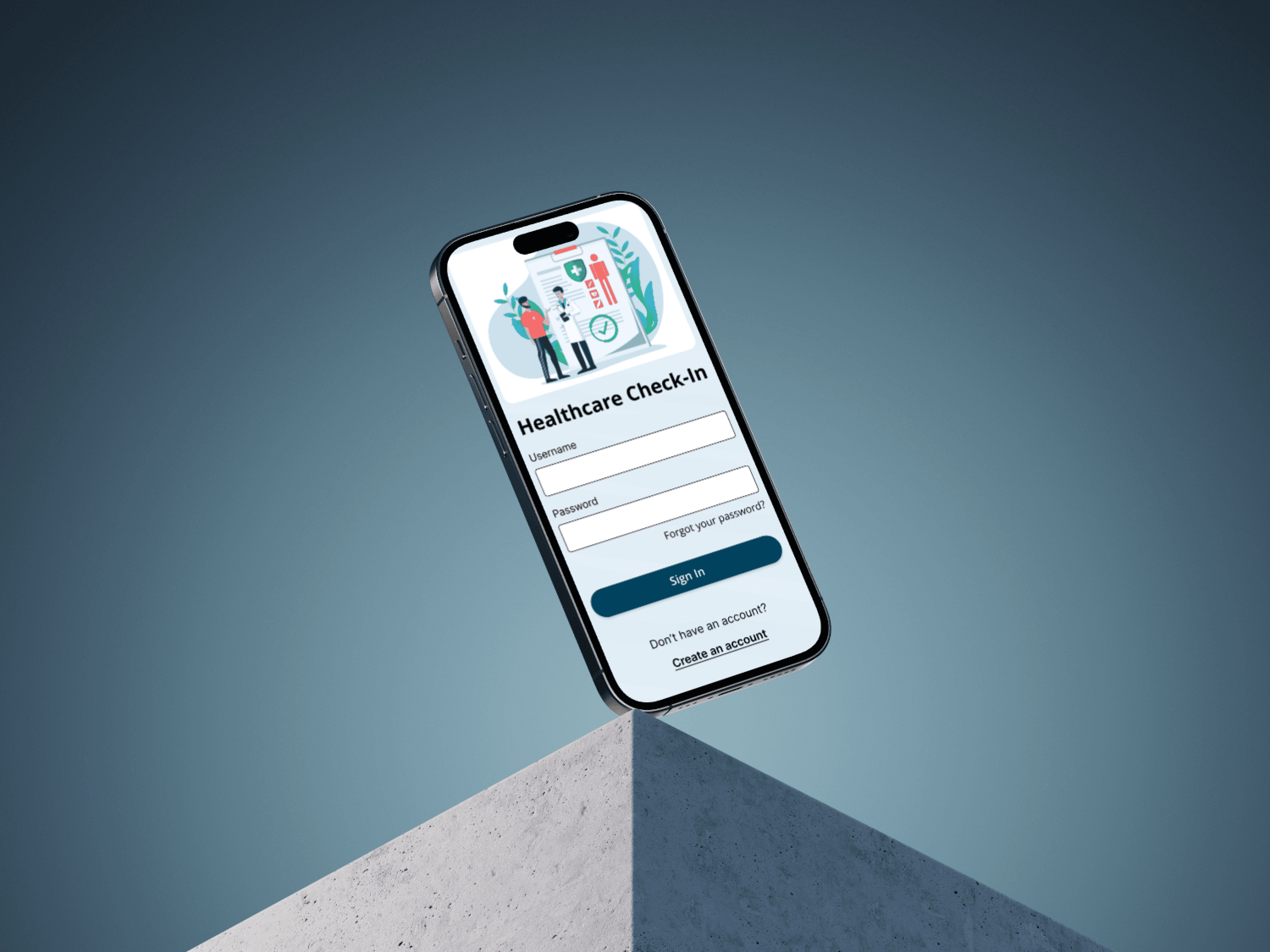
This project delivers a mobile app that simplifies healthcare check-ins, creating an efficient and user-friendly experience across devices for patients and providers.
Design Elements:
Clear Hierarchy: Guides users smoothly through check-in steps.
Bold Typography & Interactive Elements: Enhances readability and ease of use for all ages.
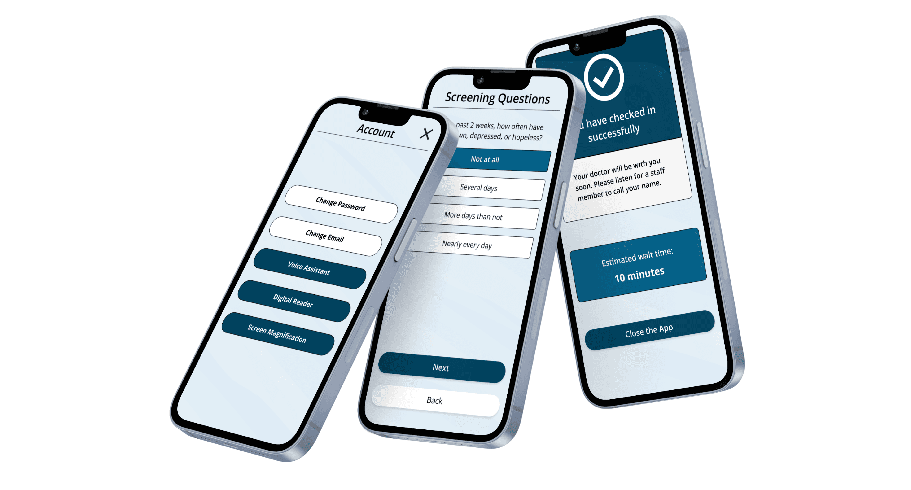
Accessibility: Meets standards with large touch targets and simple navigation.
Consistent Across Devices: Ensures smooth functionality on both mobile and tablet.
Process Highlights:
Research: Identified pain points through user and stakeholder interviews.
Wireframes: Built easy-to-follow, low-fidelity wireframes based on insights.
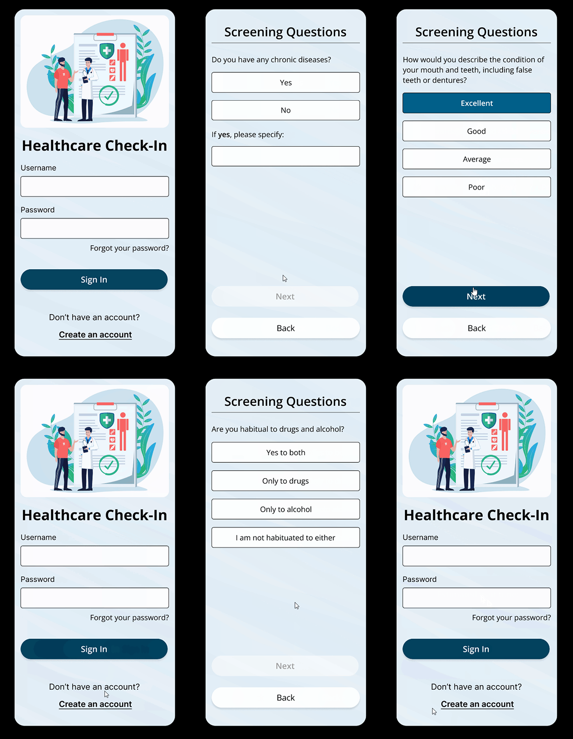
Mockups: Created high-fidelity designs with user-friendly features.
Usability Testing: Refined the app to ensure a smooth, frustration-free experience.
This project focuses on efficiency and user-friendliness, streamlining the healthcare check-in process. It simplifies patient intake, reduces wait times, and enhances the overall experience, ensuring smoother operations for both patients and providers.
The check-in process at healthcare facilities has long been a pain point for both patients and providers. Patients often face long wait times and cumbersome paperwork, while healthcare providers struggle with inefficient operations and patient flow management.
I embarked on a project to address these issues, aiming to create a digital check-in and questionnaire app that would streamline the process, making it simpler and more efficient for everyone involved.
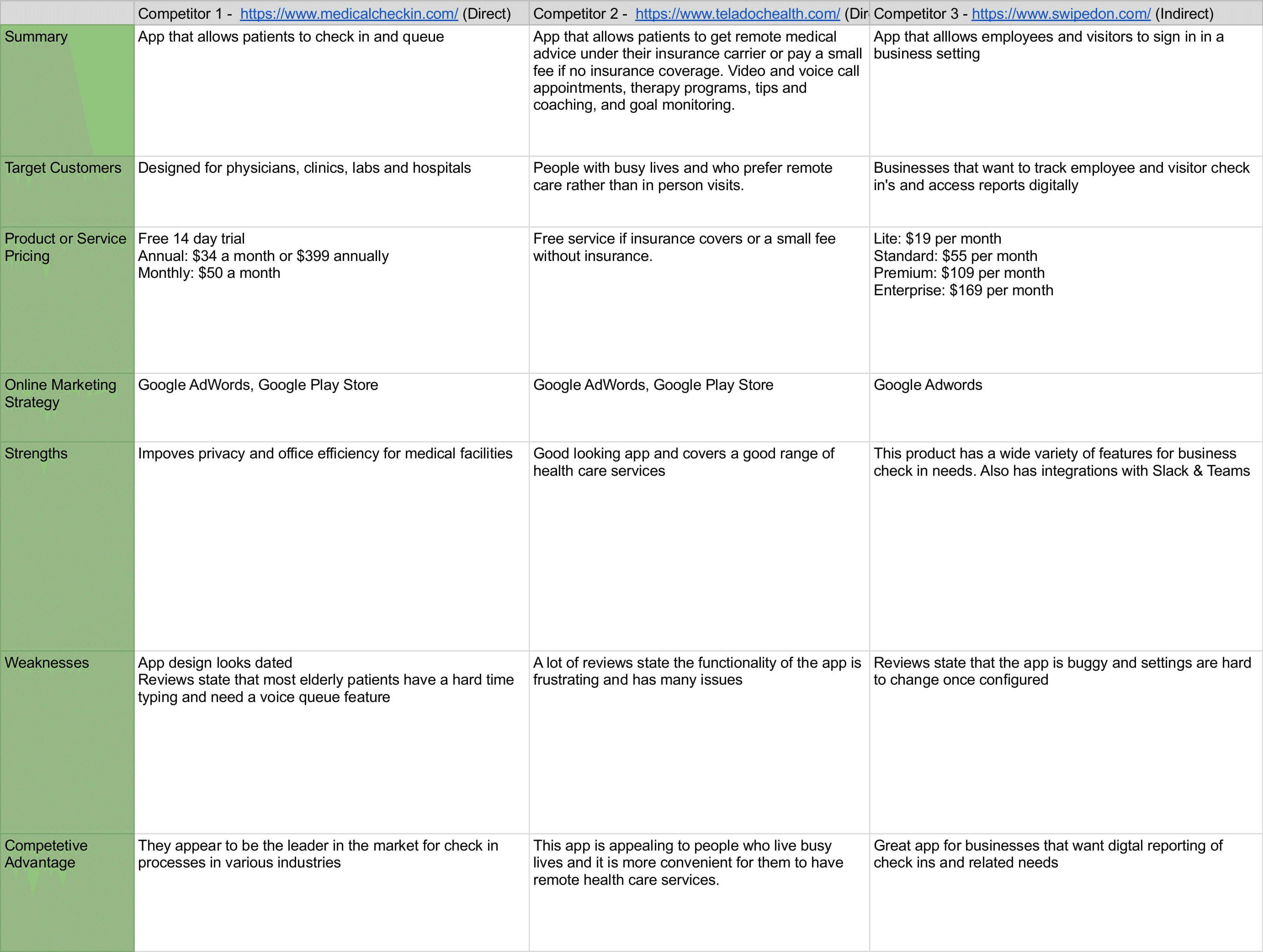
I created a competitive analysis to identify the strengths and weaknesses of existing products.
I also conducted interviews in which patients shared their dislike for filling out forms, finding the process outdated and time-consuming. They expressed frustration with confusing forms, emphasizing the need for a more intuitive, user-friendly solution. These insights motivated me to design something that truly improves the experience.
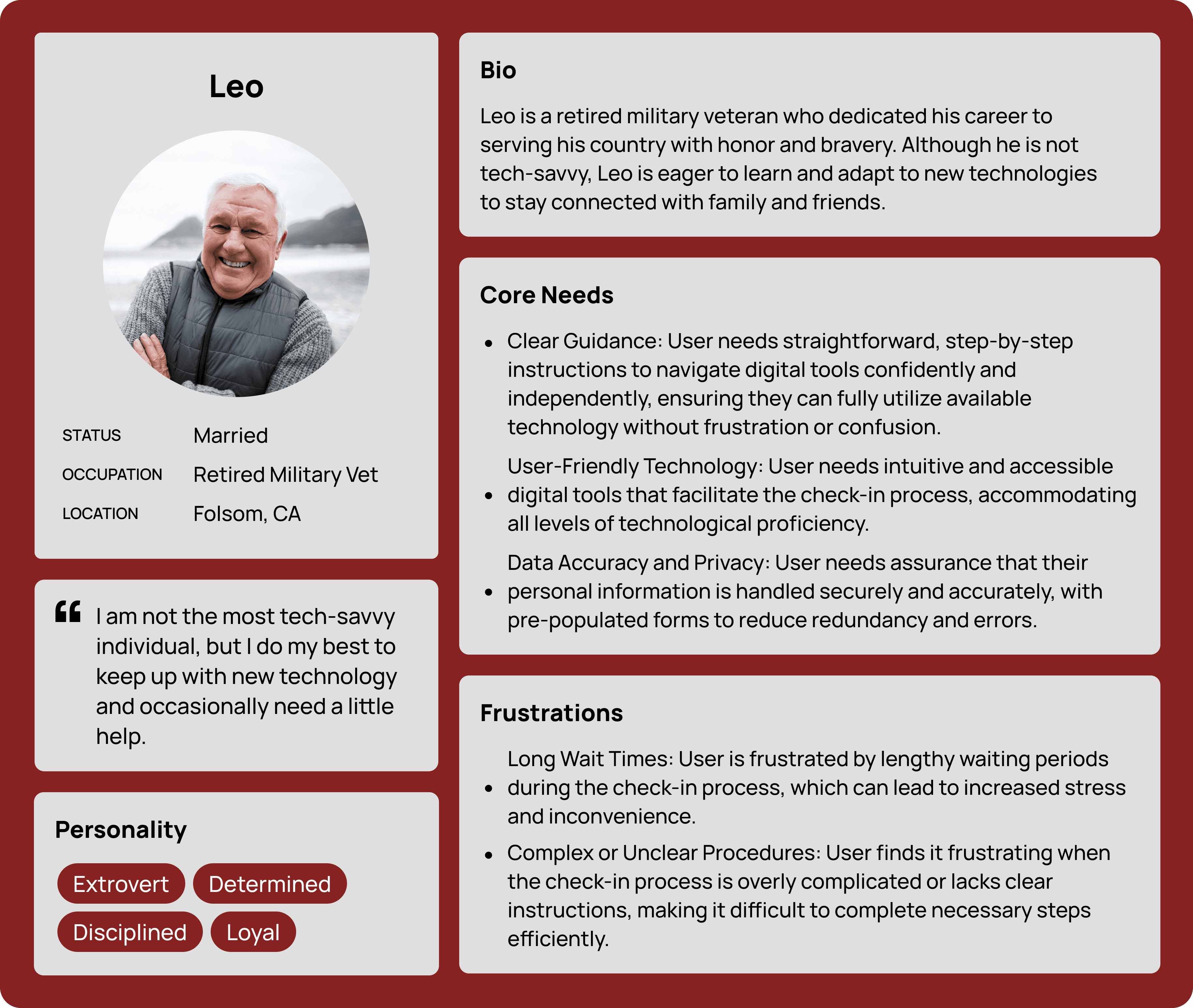
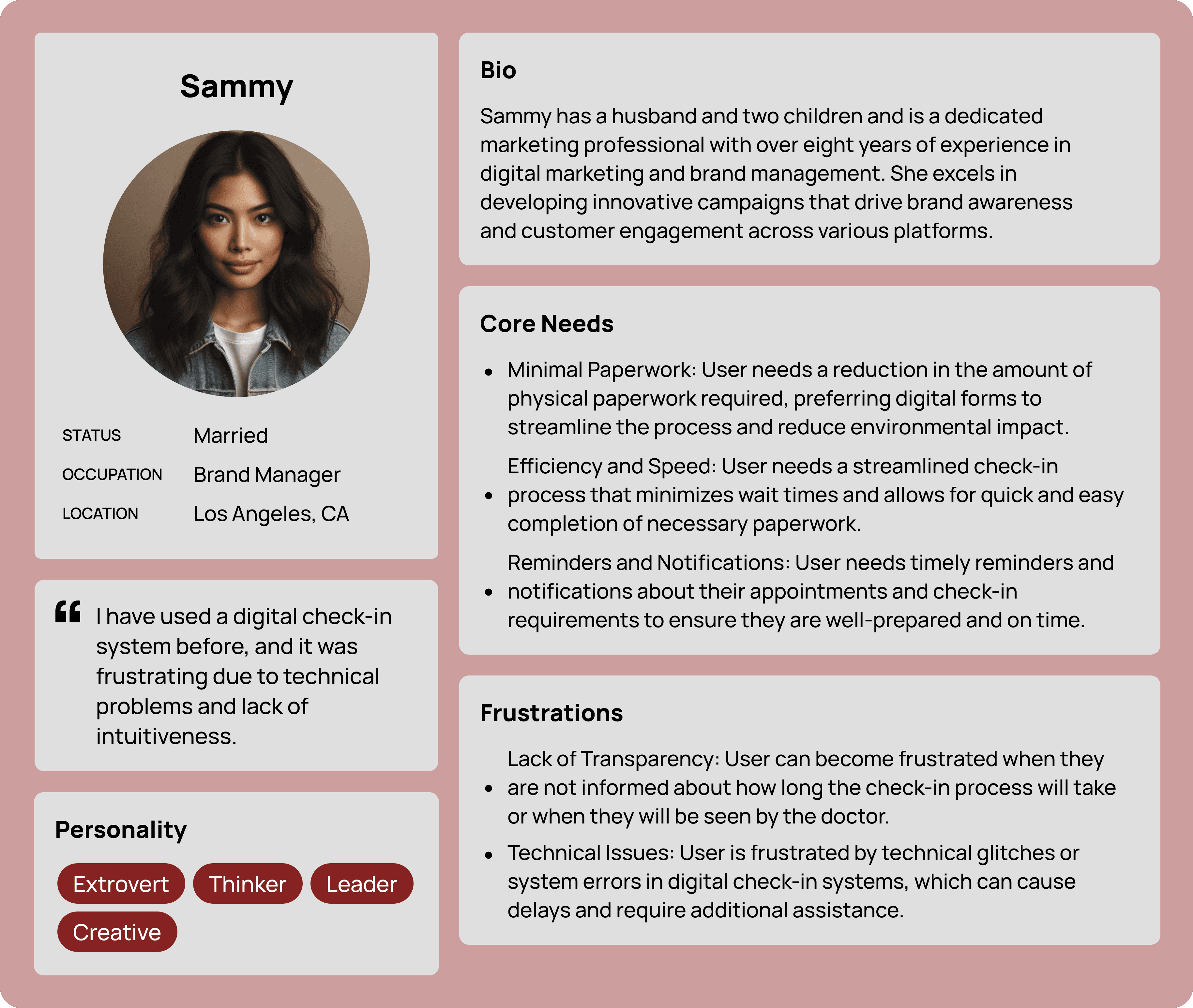
Using the insights I gathered, I identified three key user personas for the app. One is a non-tech-savvy individual needing clear guidance, another has accessibility needs and requires simple instructions, and the third values efficiency and speed, preferring minimal paperwork. Understanding their pain points and preferences helped shape the app's design.
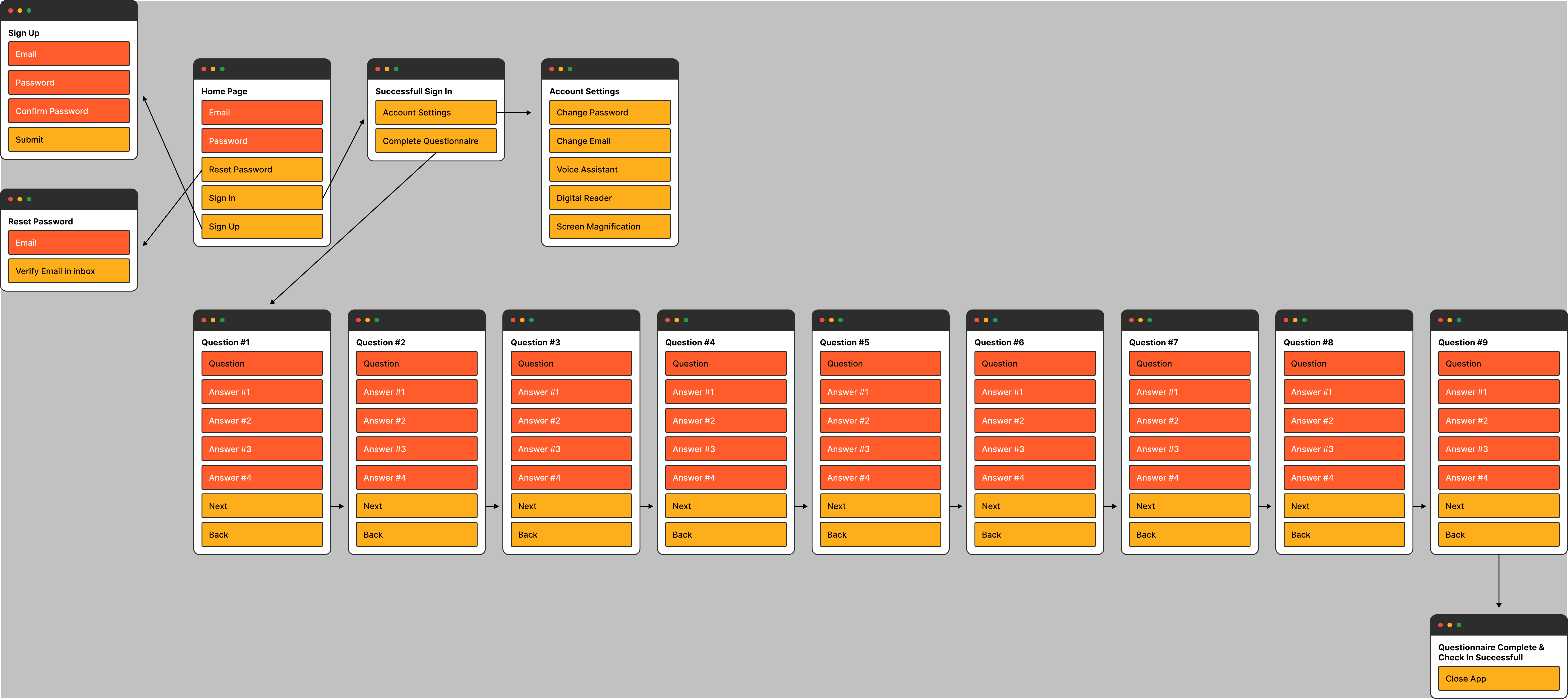
One particular pain point identified during my research was filling out complex documents. This insight became a focal point in my design process, influencing how I structured the user flows and sitemap for the project. Recognizing the need to alleviate this pain, I meticulously crafted the user experience to be as streamlined and intuitive as possible.
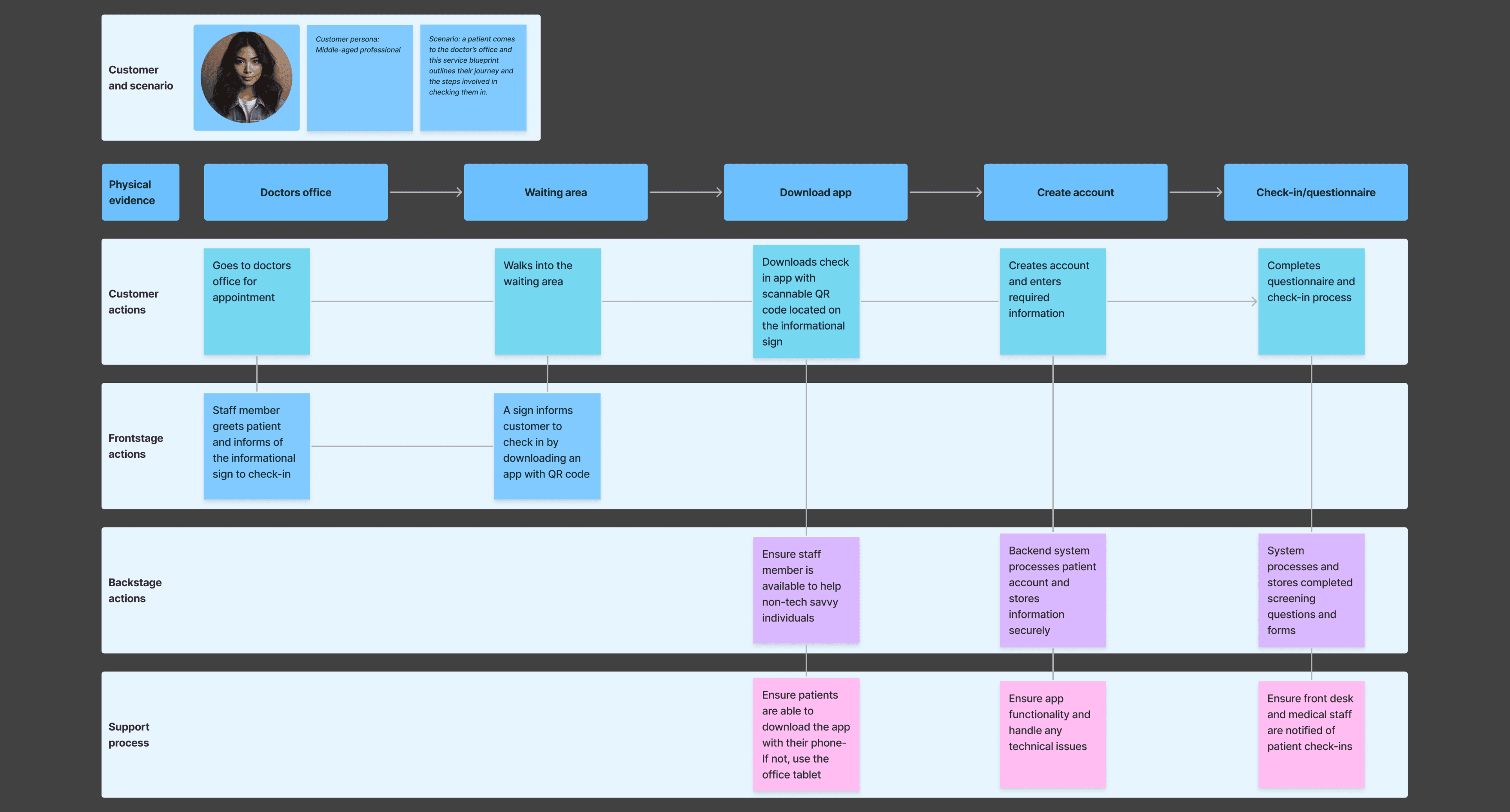
Unclear instructions was another pain point I identified in my research. I decided to create a service blueprint to envision the check-in process from start to finish. This detailed map helped the process and acted as my guide, allowing me to deeply grasp every step of the journey and envision how interactions would unfold.
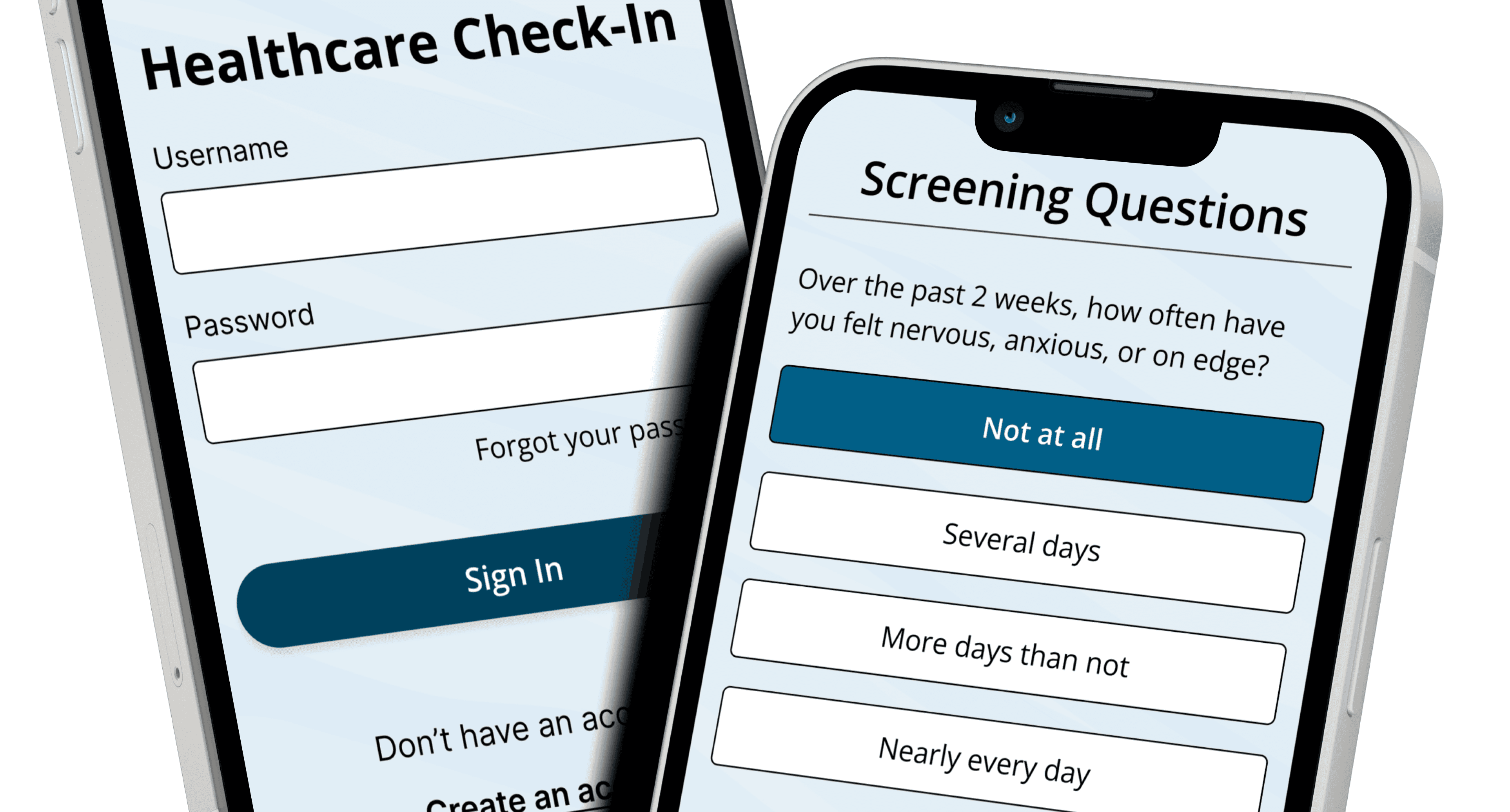
This blueprint provided a comprehensive view of the patient journey, from the initial app download and account creation to the completion of the screening questions and check-in process. By detailing these interactions, I was able to identify potential pain points and areas for improvement.
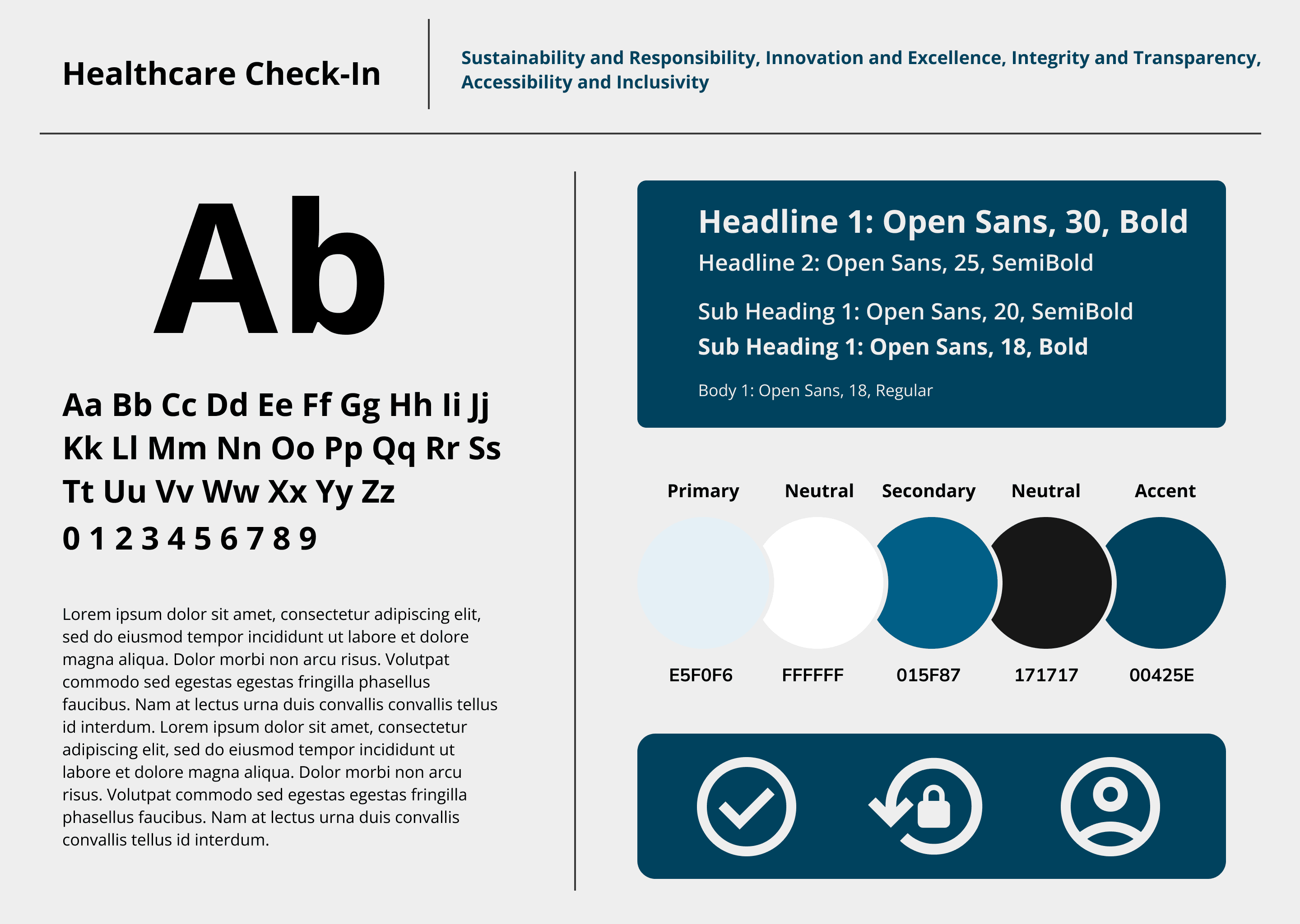
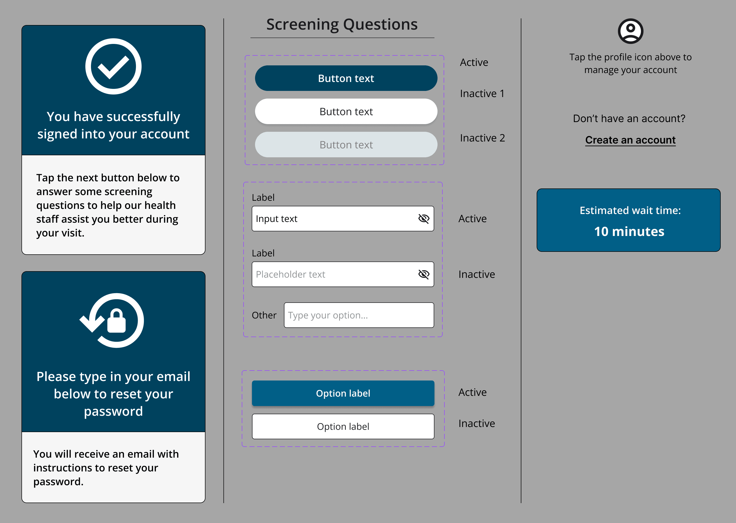
In the branding process, I aimed to balance friendliness and professionalism, using soothing blue tones to create a sense of trust and comfort. The UI kit became a key tool, allowing me to quickly experiment, adjust, and improve the interface based on user feedback. This helped maintain a consistent, polished look across all screens and refine the design to enhance the user experience.
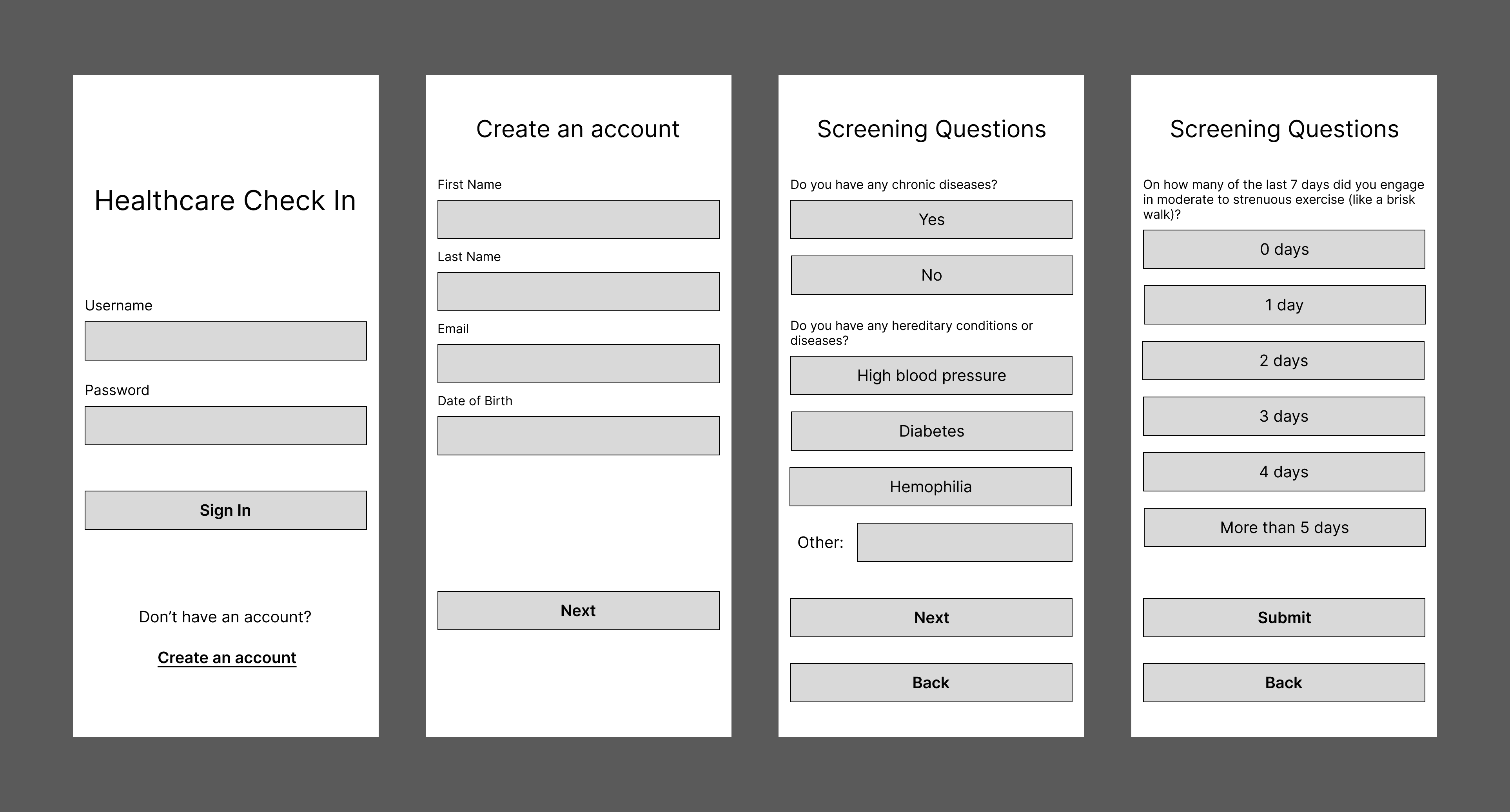
When creating the low-fidelity wireframes, I made a strong effort to keep the design as simple as possible and to create linear and straightforward UI navigation, aiming to address the pain point of confusing processes. This approach aimed to enhance user satisfaction and make the process as efficient as possible.
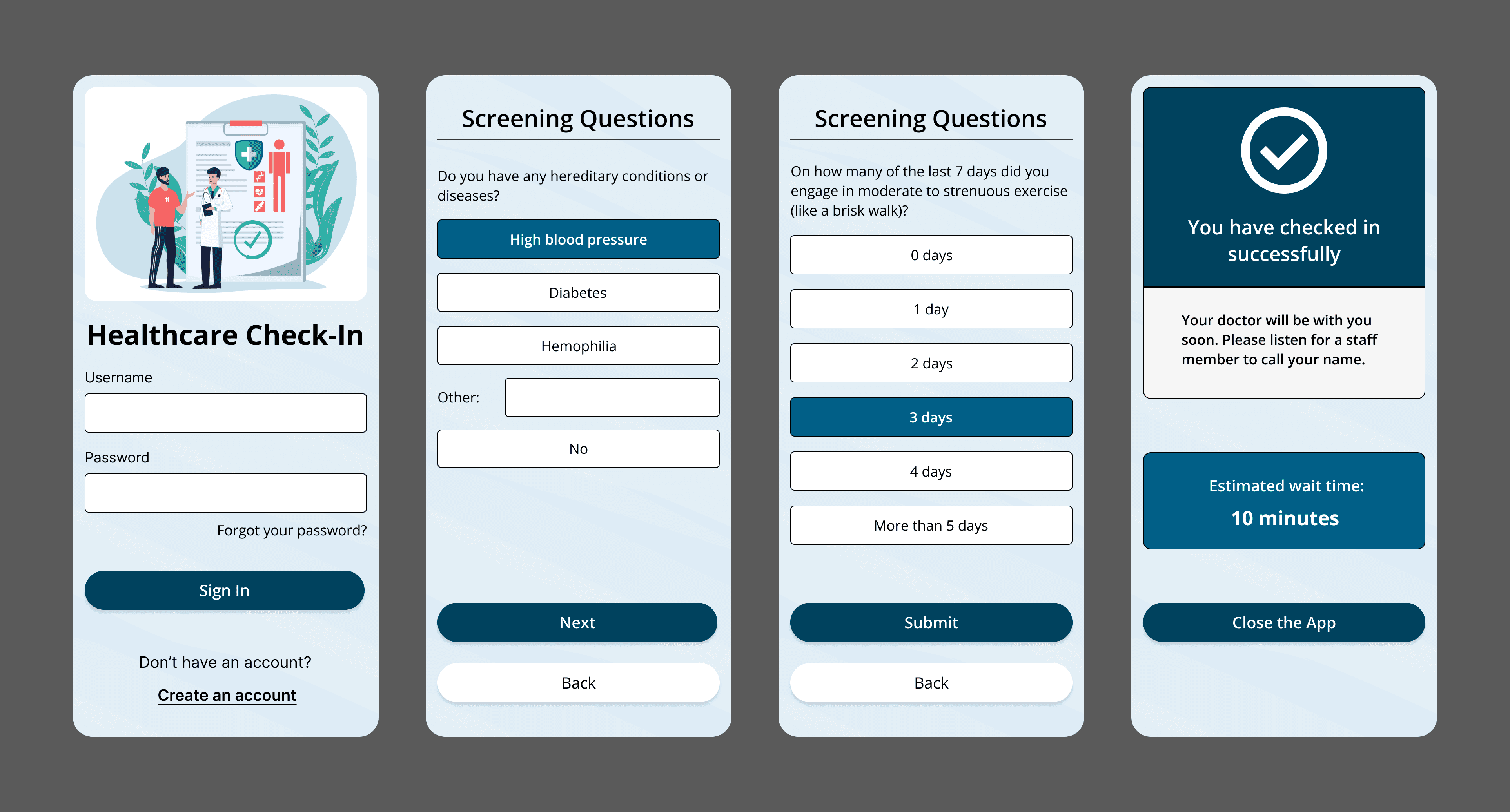
After iterating and testing the low-fidelity designs, I moved on to high-fidelity wireframes, focusing on maintaining straightforward UI navigation while providing updates and feedback on users' progress. This approach was crucial in addressing the frustration users felt with complex processes, ensuring they remained informed and confident at each step they took.
Each round of testing provided valuable insights, helping me see where users faced challenges, understand their needs better, and find areas for improvement. This careful approach ensured every detail of the design was refined to offer a smooth and satisfying user experience.
To view the Figma prototype, click here.
I learned the value of designing for everyone, not just tech-savvy users. Involving more non-tech-savvy participants could have revealed usability challenges and helped make the app even more accessible.
Still, the feedback was encouraging. Users, especially first-timers, found the flow smooth, and many wished their healthcare providers had a check-in process as simple as mine. Hearing that was meaningful, given my own frustrations with paper forms inspired the project.
This project highlighted the value of user feedback in creating effective solutions. Testing and refining the app based on real user input helped balance functionality and simplicity. Looking ahead, I plan to add features like appointment scheduling, prescription refills, AI assistance, and ongoing user feedback to enhance the app. Overall, I gained valuable skills in designing user-centered products from start to finish and take pride in creating a user-friendly check-in app for doctor's offices.
